ShopDreamUp AI ArtDreamUp
Deviation Actions


Suggested Deviants


![[Patatober] Meal](https://images-wixmp-ed30a86b8c4ca887773594c2.wixmp.com/f/a52d7d64-1160-4716-bfa6-51fc8ac5a4a4/detayrc-77354ef3-d103-4ffd-b71f-c6894d4a05c9.png/v1/crop/w_92,h_92,x_18,y_0,scl_0.12777777777778,q_70,strp/_patatober__meal_by_akitchu_detayrc-92s.jpg?token=eyJ0eXAiOiJKV1QiLCJhbGciOiJIUzI1NiJ9.eyJzdWIiOiJ1cm46YXBwOjdlMGQxODg5ODIyNjQzNzNhNWYwZDQxNWVhMGQyNmUwIiwiaXNzIjoidXJuOmFwcDo3ZTBkMTg4OTgyMjY0MzczYTVmMGQ0MTVlYTBkMjZlMCIsIm9iaiI6W1t7ImhlaWdodCI6Ijw9NzIwIiwicGF0aCI6IlwvZlwvYTUyZDdkNjQtMTE2MC00NzE2LWJmYTYtNTFmYzhhYzVhNGE0XC9kZXRheXJjLTc3MzU0ZWYzLWQxMDMtNGZmZC1iNzFmLWM2ODk0ZDRhMDVjOS5wbmciLCJ3aWR0aCI6Ijw9MTI4MCJ9XV0sImF1ZCI6WyJ1cm46c2VydmljZTppbWFnZS5vcGVyYXRpb25zIl19.gKpYzbMjB2EJcKqiQt0-T3qhaB2Z7QnKmdWDD8Gdgwk)

![[Patatober] Fever](https://images-wixmp-ed30a86b8c4ca887773594c2.wixmp.com/f/a52d7d64-1160-4716-bfa6-51fc8ac5a4a4/det3jf8-4eabbc77-6f3c-4483-9c33-3cc929292fd8.png/v1/crop/w_92,h_92,x_0,y_14,scl_0.184,q_70,strp/_patatober__fever_by_akitchu_det3jf8-92s.jpg?token=eyJ0eXAiOiJKV1QiLCJhbGciOiJIUzI1NiJ9.eyJzdWIiOiJ1cm46YXBwOjdlMGQxODg5ODIyNjQzNzNhNWYwZDQxNWVhMGQyNmUwIiwiaXNzIjoidXJuOmFwcDo3ZTBkMTg4OTgyMjY0MzczYTVmMGQ0MTVlYTBkMjZlMCIsIm9iaiI6W1t7ImhlaWdodCI6Ijw9ODAwIiwicGF0aCI6IlwvZlwvYTUyZDdkNjQtMTE2MC00NzE2LWJmYTYtNTFmYzhhYzVhNGE0XC9kZXQzamY4LTRlYWJiYzc3LTZmM2MtNDQ4My05YzMzLTNjYzkyOTI5MmZkOC5wbmciLCJ3aWR0aCI6Ijw9NTAwIn1dXSwiYXVkIjpbInVybjpzZXJ2aWNlOmltYWdlLm9wZXJhdGlvbnMiXX0.vFDa3vltisIn-Ei0jUCZBSAvstjQ12DMWPIlbCCpByk)
Suggested Collections


You Might Like…


![[Patatober] Meal](https://images-wixmp-ed30a86b8c4ca887773594c2.wixmp.com/f/a52d7d64-1160-4716-bfa6-51fc8ac5a4a4/detayrc-77354ef3-d103-4ffd-b71f-c6894d4a05c9.png/v1/crop/w_184,h_184,x_36,y_0,scl_0.25555555555556,q_70,strp/_patatober__meal_by_akitchu_detayrc-92s-2x.jpg?token=eyJ0eXAiOiJKV1QiLCJhbGciOiJIUzI1NiJ9.eyJzdWIiOiJ1cm46YXBwOjdlMGQxODg5ODIyNjQzNzNhNWYwZDQxNWVhMGQyNmUwIiwiaXNzIjoidXJuOmFwcDo3ZTBkMTg4OTgyMjY0MzczYTVmMGQ0MTVlYTBkMjZlMCIsIm9iaiI6W1t7ImhlaWdodCI6Ijw9NzIwIiwicGF0aCI6IlwvZlwvYTUyZDdkNjQtMTE2MC00NzE2LWJmYTYtNTFmYzhhYzVhNGE0XC9kZXRheXJjLTc3MzU0ZWYzLWQxMDMtNGZmZC1iNzFmLWM2ODk0ZDRhMDVjOS5wbmciLCJ3aWR0aCI6Ijw9MTI4MCJ9XV0sImF1ZCI6WyJ1cm46c2VydmljZTppbWFnZS5vcGVyYXRpb25zIl19.gKpYzbMjB2EJcKqiQt0-T3qhaB2Z7QnKmdWDD8Gdgwk)
![[Art] Ready? ( Just Shapes and Beats )](https://images-wixmp-ed30a86b8c4ca887773594c2.wixmp.com/f/761326e5-2d65-488a-a738-8061a9410a2b/dcsoxuq-e9fffe19-924a-410c-ba43-24f8ed0c4bbc.jpg/v1/crop/w_184,h_184,x_36,y_0,scl_0.17037037037037,q_70,strp/_art__ready____just_shapes_and_beats___by_hsgoldbox_dcsoxuq-92s-2x.jpg?token=eyJ0eXAiOiJKV1QiLCJhbGciOiJIUzI1NiJ9.eyJzdWIiOiJ1cm46YXBwOjdlMGQxODg5ODIyNjQzNzNhNWYwZDQxNWVhMGQyNmUwIiwiaXNzIjoidXJuOmFwcDo3ZTBkMTg4OTgyMjY0MzczYTVmMGQ0MTVlYTBkMjZlMCIsIm9iaiI6W1t7ImhlaWdodCI6Ijw9MTA4MCIsInBhdGgiOiJcL2ZcLzc2MTMyNmU1LTJkNjUtNDg4YS1hNzM4LTgwNjFhOTQxMGEyYlwvZGNzb3h1cS1lOWZmZmUxOS05MjRhLTQxMGMtYmE0My0yNGY4ZWQwYzRiYmMuanBnIiwid2lkdGgiOiI8PTE5MjAifV1dLCJhdWQiOlsidXJuOnNlcnZpY2U6aW1hZ2Uub3BlcmF0aW9ucyJdfQ.GRK2r8PK0PdyBDopI9GAW_npTKU8a-crFkx4ZwVVBlI)
![[Art] Ready? ( Just Shapes and Beats )](https://images-wixmp-ed30a86b8c4ca887773594c2.wixmp.com/f/761326e5-2d65-488a-a738-8061a9410a2b/dcsoxuq-e9fffe19-924a-410c-ba43-24f8ed0c4bbc.jpg/v1/crop/w_92,h_92,x_18,y_0,scl_0.085185185185185,q_70,strp/_art__ready____just_shapes_and_beats___by_hsgoldbox_dcsoxuq-92s.jpg?token=eyJ0eXAiOiJKV1QiLCJhbGciOiJIUzI1NiJ9.eyJzdWIiOiJ1cm46YXBwOjdlMGQxODg5ODIyNjQzNzNhNWYwZDQxNWVhMGQyNmUwIiwiaXNzIjoidXJuOmFwcDo3ZTBkMTg4OTgyMjY0MzczYTVmMGQ0MTVlYTBkMjZlMCIsIm9iaiI6W1t7ImhlaWdodCI6Ijw9MTA4MCIsInBhdGgiOiJcL2ZcLzc2MTMyNmU1LTJkNjUtNDg4YS1hNzM4LTgwNjFhOTQxMGEyYlwvZGNzb3h1cS1lOWZmZmUxOS05MjRhLTQxMGMtYmE0My0yNGY4ZWQwYzRiYmMuanBnIiwid2lkdGgiOiI8PTE5MjAifV1dLCJhdWQiOlsidXJuOnNlcnZpY2U6aW1hZ2Uub3BlcmF0aW9ucyJdfQ.GRK2r8PK0PdyBDopI9GAW_npTKU8a-crFkx4ZwVVBlI)

Description
Okey, this is a try for a totally different style than my usual. As I'm a really big fan och gradients and shadows and such, this was kind of a challenge.
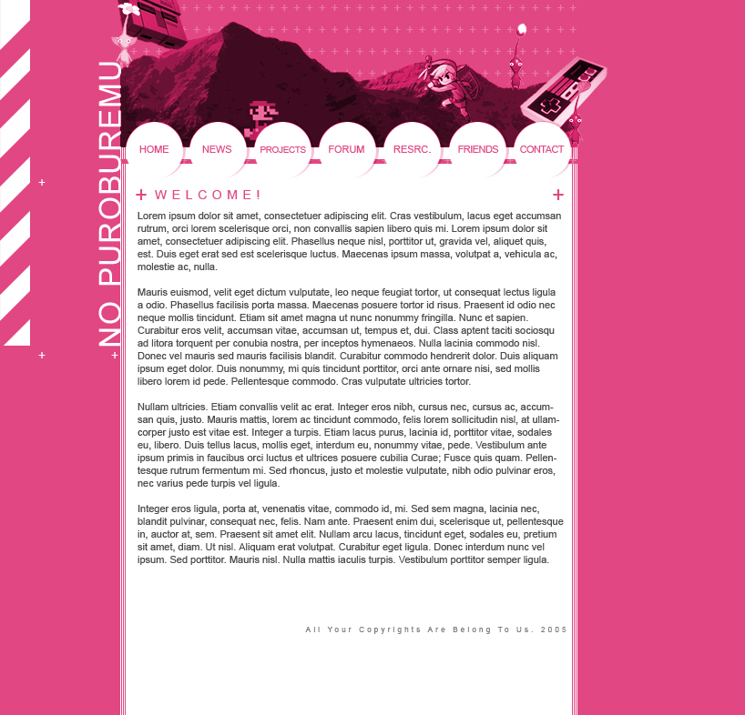
"No Puroburemu!" should be "no problem" said by a Japanese, and the site is supposed to be for a community for amateur game developers.
I've noticed that some really don't like the design, but others do (will I ever be able to please everyone?). Some have complained about the colors, but personally I like them and they will not be changed. A part of that problem would be that photoshop's colors isn't the same as the JPG's, which always is extremely annoying and makes it too troublesome to fix... So you'll just have to live with it if your eyes are exploading, or change your screen settings
The textlayout is very simple and only aims to be effective, so no need to insert all those flashy pictures here.
As usual, anyone is welcome to use the design, just notify me... ^^
Oh, and yeah... thanks and hugs to doppler, ShellFish and docster for comment and thoughts!
Image size
818x786px 348.66 KB
© 2005 - 2024 pannpann
Comments4
Join the community to add your comment. Already a deviant? Log In
The pink is cool and different but depending on target audience most might be displeased. If it's for gamers who the majority are males...that's definitely a no no because 8/10 guys won't like the pink. Doesn't feel masculine because the stereotype is that pink is feminine. Just my take on color where target audience is concerned. However, great design.